 |
| More interesting than half empty shelves. |
After having such a great time at Clark, I headed to Spokane Community College to have some fun in their book store. The crew was excited to get ready, but this time I took some before pictures so that we can compare the differences. I get stores asking if I will come in and help "redo their store." It isn't so much that I come in and have five million ideas that sprout out and take over, but that someone who isn't in that store all the time has a different perspective. Think of it; these stores are our homes
(be honest, you've slept at your desk, too) and sometimes we don't see the mess in the kitchen or the dust on the tables. We get a certain blindness that accompanies being in any one location for too long. Having others from outside of our store working on displays gives us a perspective we didn't have, or simply couldn't see.
 |
| Nice and full! |
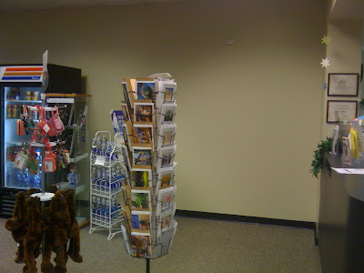
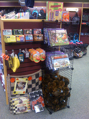
The first thing I usually notice isn't so much as displays lacking in drama, but space being under utilized. For example, there was a TON of just empty floor and slat wall space. A full looking store sells better than an empty looking store, and large sections of dead space are not only useless in terms of sales, but can look barren...and creepy.
 |
| Half empty with no theme. |
 |
| This is not a good use of space. |
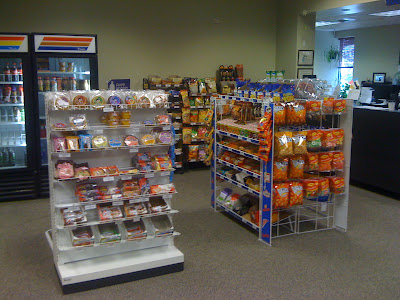
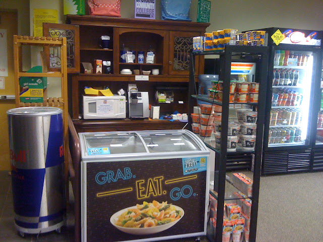
I had never worked with a college store that had a large c-store selection in it, so I was kind of excited to move some of the racks around to better form the space. That is until I kicked the soda machine in my flip flops and yelled "BOB SAGET!" really loud, but I digress. The section here was spread out so much that it didn't make sense, but if we consolidated too much, then registers needed for rush would have no room. We finagled the candy units to make more box like feel to the section. New appliances will be coming in the fall, so when those arrive, the beautiful hutch will be moved to the center of the wall, becoming a focal point and adding warmth and a homey feeling to the section.
 |
| Unless you're selling wall space, fill in those gaps! |
 |
| Tighten the fixtures to give more context to the space. |
 |
| This beautiful hutch will be the focal point in the center of the wall. |
When rethinking your displays, start with clearing off all of the fixtures. That way you can have a clear view of your display area and can more easily imagine the possibilities with it. If you just try to move product around on a fixture without clearing it off, you are so distracted by the items you move around that you can't really get anywhere with a new concept.
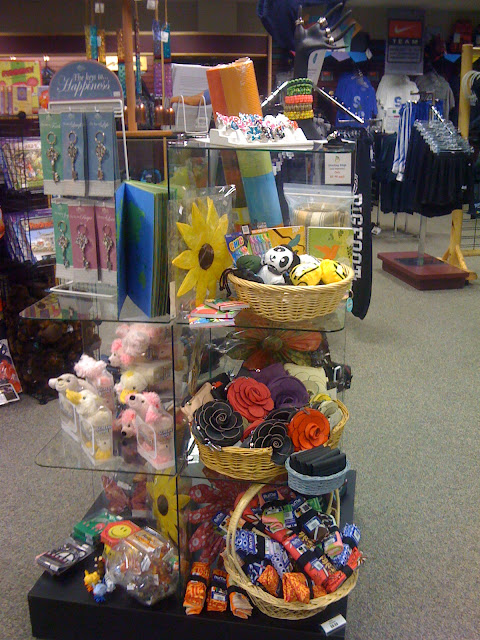
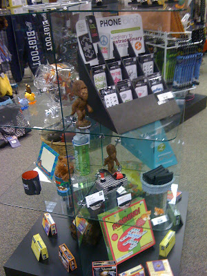
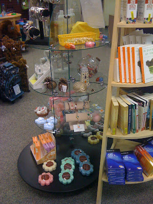
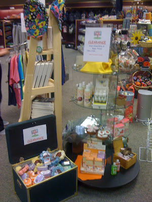
The only thing worse than too much product on a glass fixture is not enough. Barely merchandised shelves add to a stores' barren appearance and leaves the customers with the impression that all of the products left are old and unwanted. If you aren't sure where to start, you can divide a four sided display into four different color stories, or have an overall theme of the unit. Dividing up the fixture to tell multiple stories can make it easier if you don't necessarily have all of your creative juices flowing.
 |
| Barren and boring. |
 |
| Much better! LOOK! A treasure box! |
 |
| Not very appealing. |
And don't forget, items that are just hanging around in ones or twos look like left overs. So don't spread your merchandise out too thin-group together to add the appearance of abundance, even of it's only sale items.
 |
| Sometimes just a little rearranging makes the difference |
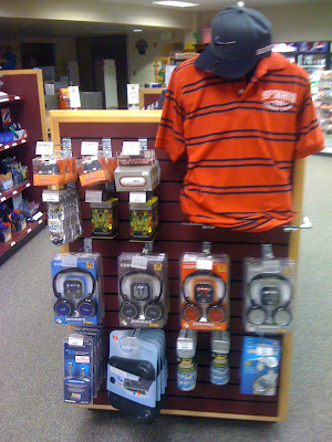
Take your end caps and gear them towards particular shoppers. Our peeps put together two small tech displays, one for the ladies and one for the gentlemen. By adding a form or a mannequin, you're not only adding some context, but you're also adding some visual drama. Coordinate the items in the display with items you see your customers looking for or items you want to highlight, like some super blingy speakers or headphones.


 |
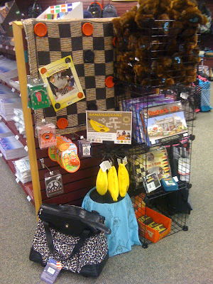
| OMG I must touch whatever that thing is!! |
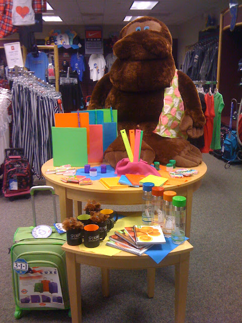
Do you have some sort of large, unruly stuffed animal that may happen to be your mascot? Put it to work! Highlight it on your big tables, build displays around it, anything! You spent the money (I highly doubt it was free), so put a hoodie and a backpack on that big boy and make it earn it's keep. Not only will it draw the customers attention, you might find someone crazy enough to buy it from you.
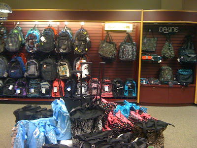
When I arrived at the store, I noticed that the big backpack area was a hot mess.
No one likes a hot mess. Make sure that your backpacks are neat and tight. They will get messy as the customer finds the right one, but don't create a messy display just because you don't want to clean as you merchandise. Make sure that you are also properly utilizing your highlighted staging areas. Don't throw a ton of product in it simply because you are too overwhelmed to properly display. Leaving a highlight area a disaster does a disservice to your store and your product. We cleaned up this area and made it more of a destination stop for ladies purses and bags.


 |
| Full book displays sell better. It's a fact. |
Remember that full displays, whether they are sale items or new arrivals, need to be full and clean. Have two half empty displays? Put the two together, re-merchandise, give the display a new story and use the second fixture for new products.
Customers have a short attention span, so merchandising is more important than ever. Don't lose a sale simply because you didn't want to redo your displays. Product should be completely re-merchandised at least every month if not quicker, so if you have displays that are a year old
(and don't act like you don't), than you are a very bad panda and you have some work to do before school starts.
Right? Right.
